This blog post is the second in a series of posts based on my talk at the German Dev Days 2025, which covered various methods for reducing the size of textures in games. You can find the first one, which explains how to reduce the size of your UI textures, here.
Needlessly Big Textures
Every game out there has them: Needlessly big textures. They are usually easy to spot, because they often look like this:

This is a texture I found on Polyhaven. Now, there’s nothing wrong with that texture per se. It’s just a picture of a plain wall, so it’s not going to have a lot of noticeable details. What bothers me, though, is that this texture has a resolution of 2048²px (Polyhaven even offers this texture in resolutions up to 16k). For comparison, this is the same texture scaled down to 64²px:

If you’re able to notice the difference without scrolling back to the previous texture and comparing, your eyes are better than mine.
While this example is easy to spot, the issue still exists in other cases, just not as noticeably:
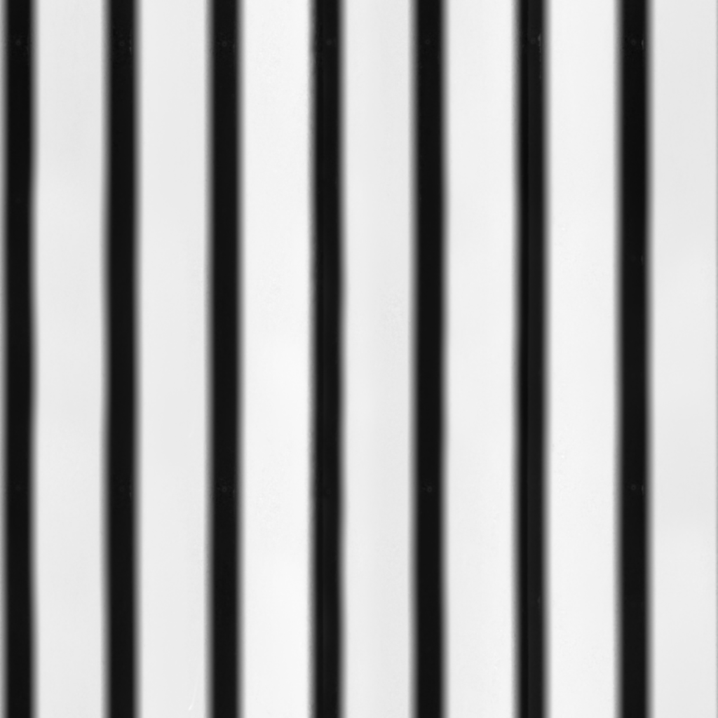
This texture (a height map of a corrugated metal wall) isn’t just a plain color. However, you can easily scale it down considerably without any noticeable visual difference:
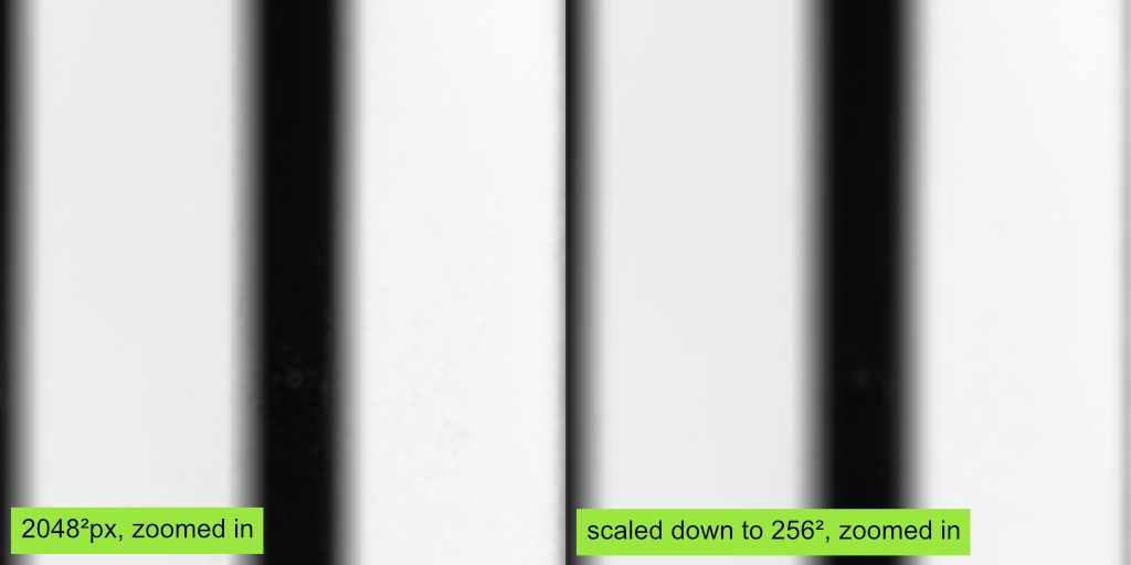
The scaled-down version is 98.4% smaller than the original. Compared with the original, the new size is akin to a rounding error.
How does this happen
When artists start working on a texture, their first thought isn’t about how big the texture should be in the end (and rightfully so). Most textures in a project are usually authored at a default resolution of 2k or 4k. Texture creation tools like Substance, which help to create all maps needed for a material at once, assume that all textures used for the same surface should use the same resolution.
However, It’s not uncommon for base color textures of uniformly colored materials to contain far less detail than the roughness or normal map. Height maps, in particular, tend to contain less high-frequency detail. For techniques like parallax mapping or displacement, too many high-frequency details can cause problems and visual artifacts, so it’s not uncommon for the height maps to get slightly blurred for the export.
Why is this bad
It almost goes without saying, but larger textures require more space on the hard drive, use more memory, and take longer to sample if the GPU is bandwidth-limited.
In some cases, they can even reduce the game’s visual quality. Most games nowadays use texture streaming. The more textures that need to be streamed in at high resolutions, the longer does it take to load all textures at the required resolution. Reducing the resolution of textures that don’t require as many pixels increases the speed at which the remaining textures can be streamed, reducing noticeable texture pop-in.
What can you do about it?
The easiest and most intuitive way to handle this issue is to scale down the textures as needed. Go through your project folder, open each texture, and adjust the resolution as needed. I’ve used this approach often enough to know that it works.
Still, I’m not a fan of doing this. It’s tedious, and human judgment is unreliable and inconsistent. A size reduction that seems fine one day might seem too drastic the next, and vice versa. Once several people are involved, the results become even more inconsistent. As a result, you may end up with blurry textures in one place while using needlessly large resolutions in another.
After experiencing these issues a few times, I decided that I needed a better method. No more subjective decisions. I wanted them to be informed by hard numbers.
So, how do you get these numbers?
It turns out, you can just compare the mip maps of a texture to measure how much of its information remains present in each one.
To do that, I calculate the difference between the color of each pixel and the corresponding pixel in the next, smaller mip map. By doing this for all pixels, adding the results and dividing the result by the number of pixels, I get the average per-pixel difference between the mip maps.
Now, let’s put these numbers in a graph:
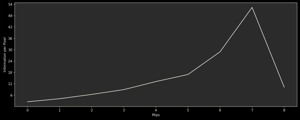
This graph shows how the texture’s information is distributed among the mip maps. I mean this literally, because by adding the differences between the mip maps together, you get the original image again. For more information, I recommend reading up on Laplacian Pyramids. They are a super useful concept for image processing and shaders. One common use case is creating natural-looking blends between different textures, because they enable you to blend the different frequencies in the image with appropriately scaled transition areas.
Now, let’s look at the graphs of a few textures:
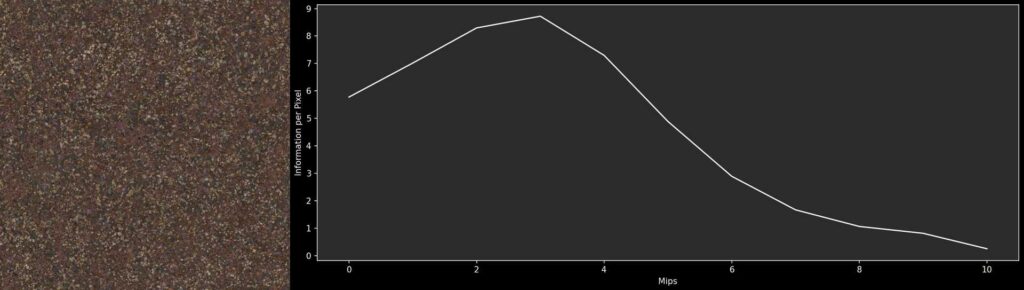
This gravel texture is full of high-frequency details. As result, mip 0 contains a lot of information, and the next few mip maps contain even more. In contrast, the last few mips don’t contribute much to the texture anymore. When the image is scaled down, it eventually becomes a uniform brownish color.
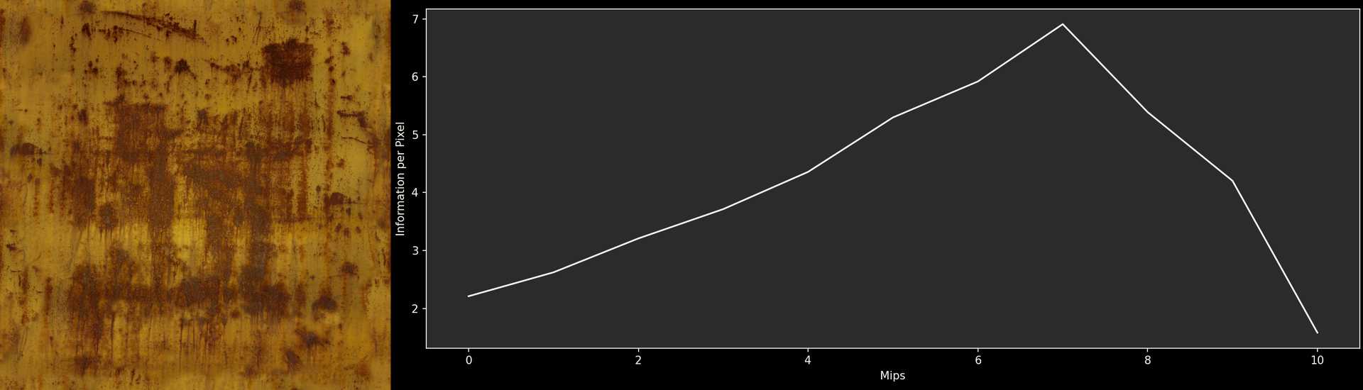
This rust texture is essentially the opposite. Most of the information is contained in the smaller mip maps. Even the very small mip maps contain the subtle color variations of the yellow paint and the gradual transitions between rusty and non-rusty parts. Mip 0 contributes almost nothing to the texture and can be removed without anyone noticing.
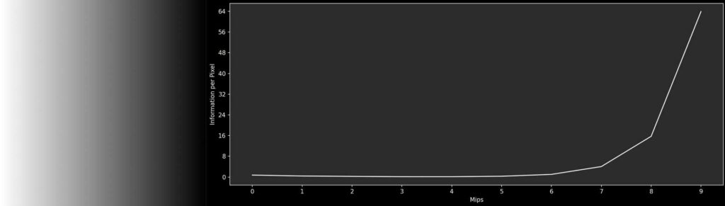
This gradient texture is an example of a texture that is clearly too large. The first six mip maps contain no information because scaling up the smaller mip maps linearly results in an image identical to Mip 0.
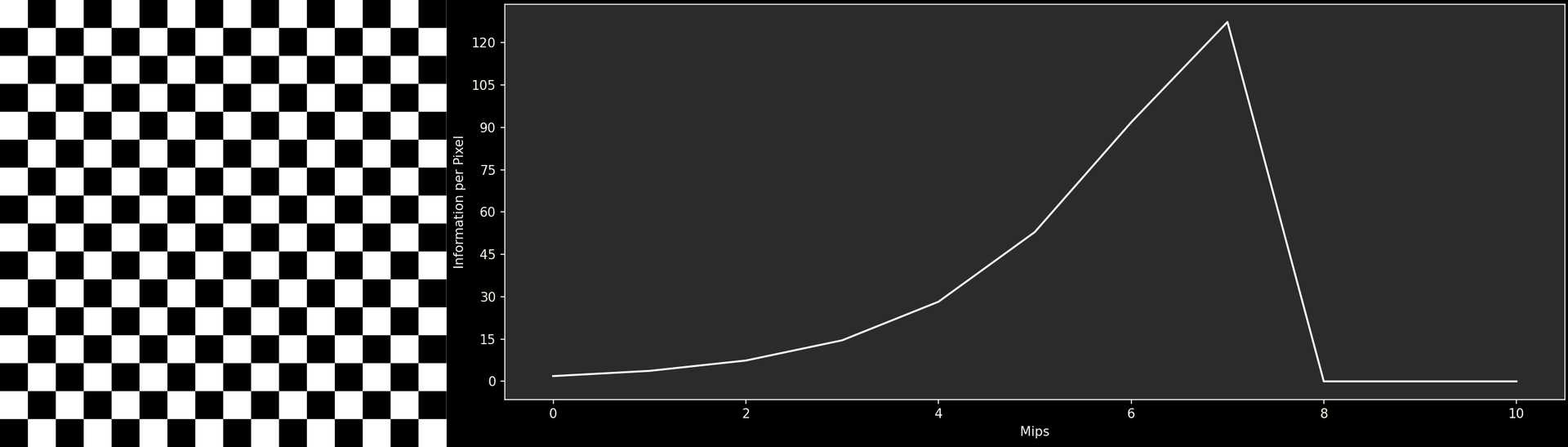
This checkerboard has a very unique graph: Although there are sharp edges, most adjacent pixels are the same color. As a result, the difference between Mip 0 an Mip 1 is minimal. The following mip maps contain more and more information, as the number of pixels with identical pixels around them shrinks. But at Mip 7, the individual squares reach the size of only one pixel. Therefore, each pixels in Mip 8 is the average of 2 white and 2 black pixels. As a result, the texture is just a medium gray. After this point, all subsequent Mips look identical, not containing any information.
The Tool
If you found the results interesting so far, consider yourself lucky. After creating the tool for these graphs, I felt that others might find the results interesting as well. so I polished it a bit and made it available on Github, under the name Mip Explorer:
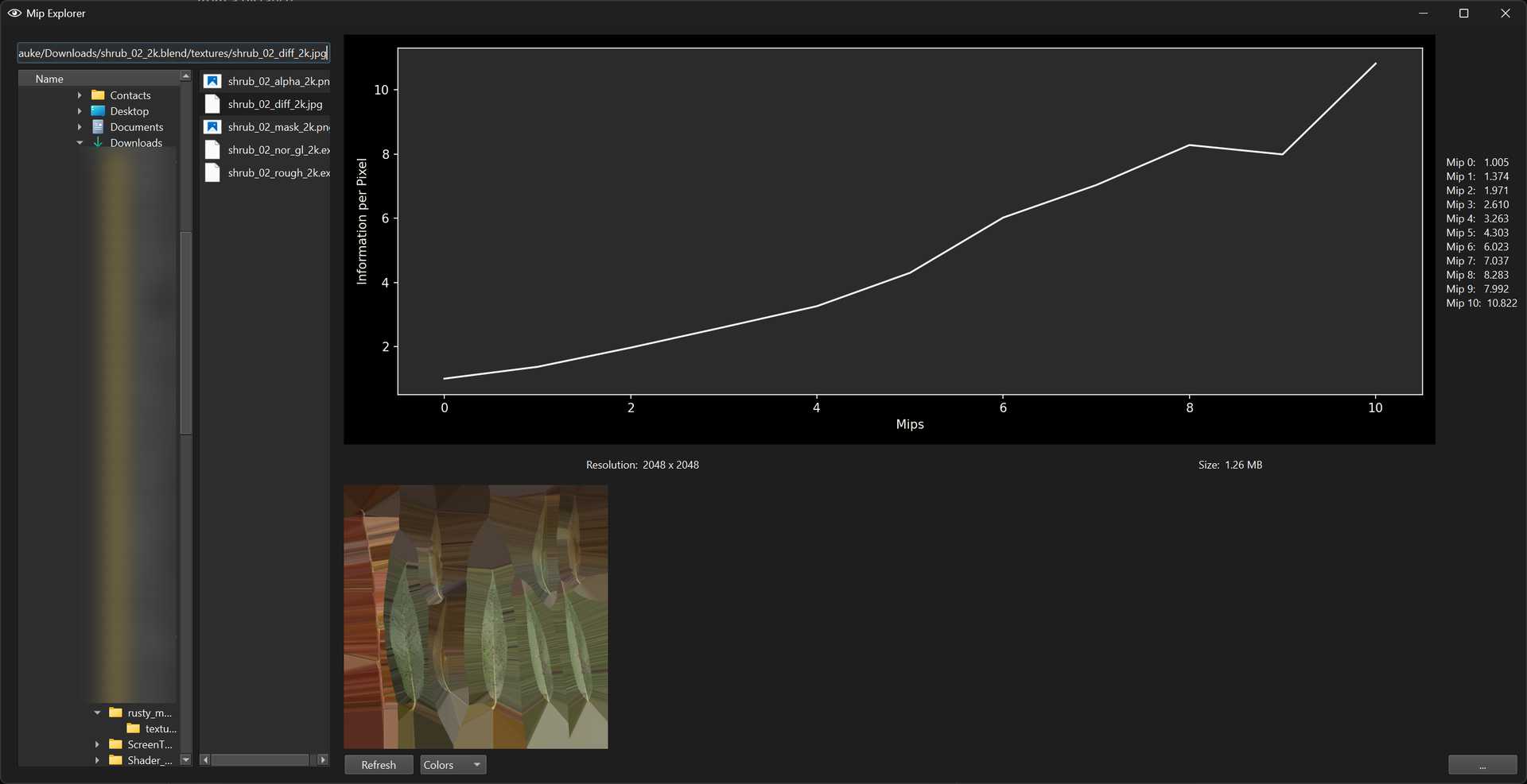
Mip Explorer is intended to be used to facilitate discussions about how large textures actually need to be, and to get a better understanding of how textures consist of differently scaled frequencies. It can also be used as a starting point for automatic validation or optimization by flagging needlessly large textures or scaling down textures if their Mip 0 doesn’t contain enough detail to justify its existence.
Mip Explorer is written in Python. I tried to stick to the standard library, but ended up using some libraries, so you’ll need to install some dependencies for the tool to work.
Feedback
If you try out Mip Explorer for yourself, please feel free to reach out to me with any feedback you might have. Whether it’s bugs, feature requests or questions, I’ll happily read every message sent to me. Right now, the Mip Explorer works on my PC™, but I’m sure it has its shortcomings that need to be fixed or improved.
Open Topics
Mip Explorer is already functional and can be quite useful. However, there are some areas in which I would like to improve the tool, as well as some issues for which I haven’t found a satisfactory solution yet:
Human Perception
Arguably, there’s a difference between the numerically measured differences between two images and how the human eye and mind perceive those differences. For example, if you overlay subtle blue noise on your image with low opacity, the noise will essentially disappear in Mip 1. Numerically, there would be a considerable difference. However, blue noise is easily overlooked (that’s why it’s used for dithering effects), so most people wouldn’t notice the difference. Conversely, a single black pixel in an otherwise white texture immediately catches the viewer’s attention. The disappearance of this pixel in smaller mip maps would be noticeable, even though the numerical difference is small.
I don’t know how to tackle this. Human perception is incredibly complex, and people way smarter than me already have failed at this challenge. Rather than simply measuring the differences, the surrounding pixels would probably need to be factored in. Perhaps (and I’m not saying this lightly) even machine learning could be of help here. With a large set of images and ratings of their similarity, you could train a model to make reasonable guesses about how humans would evaluate their similarity.
Measuring Differences
Setting aside the broad topic of human perception, my current comparison method isn’t ideal. Currently, I’m just measuring the differences per channel and calculating the average. For color textures, at least the channels are weighted, so a difference in the green channel affects the result more than a difference in the red or blue channel because the human eye is more sensitive to green.
As far as I understand the topic by now, a better way to calculate the differences is to convert the images to the Oklab color space and calculate the geometric distances between the colors.