As mentioned in my last article, a tutorial on how to implement Laplacian texture blending in Substance Designer, I’m not exactly happy with Adobe’s licensing options, or recent changes to their terms of service. So I looked for alternatives, and quickly found InstaMAT, another node-based texture creation software. InstaMAT is free for individuals or companies with a revenue smaller than 100.000€/year, and there are perpetual licenses available, which I always prefer to subscriptions. To test it and see how well it works for me, I opted to implement Laplacian texture blending in this software as well. This is how this article came to be.
If you own InstaMAT, this tutorial is hopefully helpful to you as it shows you how to implement Laplacian texture blending, a helpful technique when creating composited materials. If you don’t, it’s hopefully an interesting look outside the box that is Substance Designer.
What is Laplacian Texture Blending
One of the most common operations when authoring materials is blending together different textures using a mask. It’s a great way to create new textures by combining existing ones, or to have more options for adding variation during rendering.
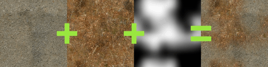
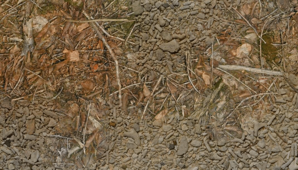
But very often when you use a soft mask, this is what you get:
Both textures, the forest ground texture and the pebbles texture, are simply layered on top of each other, and details such as sticks and pebbles are noticeably transparent. Also, in the areas where the textures are displayed with reduced opacity, the effective contrast of the resulting texture is noticeably lower than in the areas where only one texture is displayed.
There are several ways to fix/improve this situation:
- Using height-blending, you can create a mask that is affected by the heights of the details. This allows you to use a higher mask contrast without creating a noticeable edge.
- You can increase the contrast of the result in the blended regions based on the opacity of the source textures to maintain an even contrast throughout the texture.
Neither solution is perfect. Increasing the contrast in the blended areas doesn’t fix ghosting. And height blending is only an option when height maps are available, which isn’t always the case. And even then, its usefulness depends on fine-grained, noisy height maps, and on all contrasty details actually being present in the height map. So if a material has a lot of details in the base color that aren’t present in the height map, height blending won’t help preserve them during blending.
Another approach to this problem was recently proposed by Bart Wronski, research scientist at Nvidia. It got published here in the Journal of Computer Graphics Techniques. I highly recommend reading it because it has two very strong qualities: It’s a) very clever and b) relatively simple once you understand how it works. The technique is called Laplacian texture blending, because it uses a Laplacian Pyramid. I won’t describe the technique in detail (that’s what the paper is for), but the basic idea is that instead of blending the two textures with one mask, the textures are split into several frequency bands. These frequency bands are then blended together using separate masks. The high frequency bands are blended with a high frequency mask, while the low frequency bands are blended with low frequency (read: blurred) versions of the mask. This way, the contrast of the small details in the textures is preserved, while the low-frequency elements, such as the dominant colors, are blended very softly.
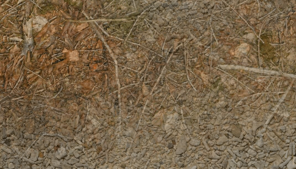
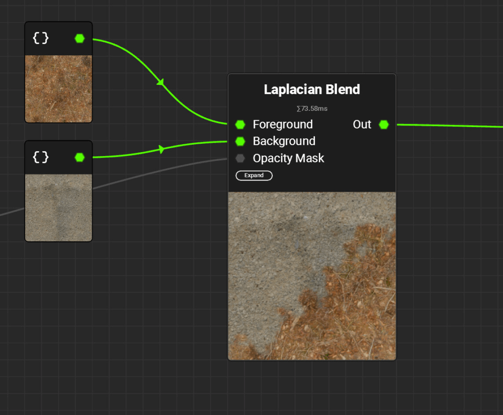
Let’s see what the result looks like:
Compared to the classic blend, ghosting is dramatically reduced. Details remain intact and distinct, and local contrast remains consistent throughout the texture.
A few notes first:
- This tutorial explains how to implement the technique with a fixed number of mip levels. If you’re actually going to use this in production, I would recommend letting the user control the number of levels so they can control how soft they want the blend to be.
- Since the tutorial only covers how to implement the technique in InstaMAT, I highly recommend reading Wronski’s paper to understand how the technique works before starting the tutorial, as I won’t go into the details.
Step 1 – How to separate Frequency Bands
The first step is to separate the frequency bands present in the mip maps of the input textures. Due to the smaller resolution, each mip map in the chain loses the highest frequencies, as there are not enough pixels anymore to display them. Therefore, you can isolate these frequencies by subtracting the smaller mipmap from the bigger one:
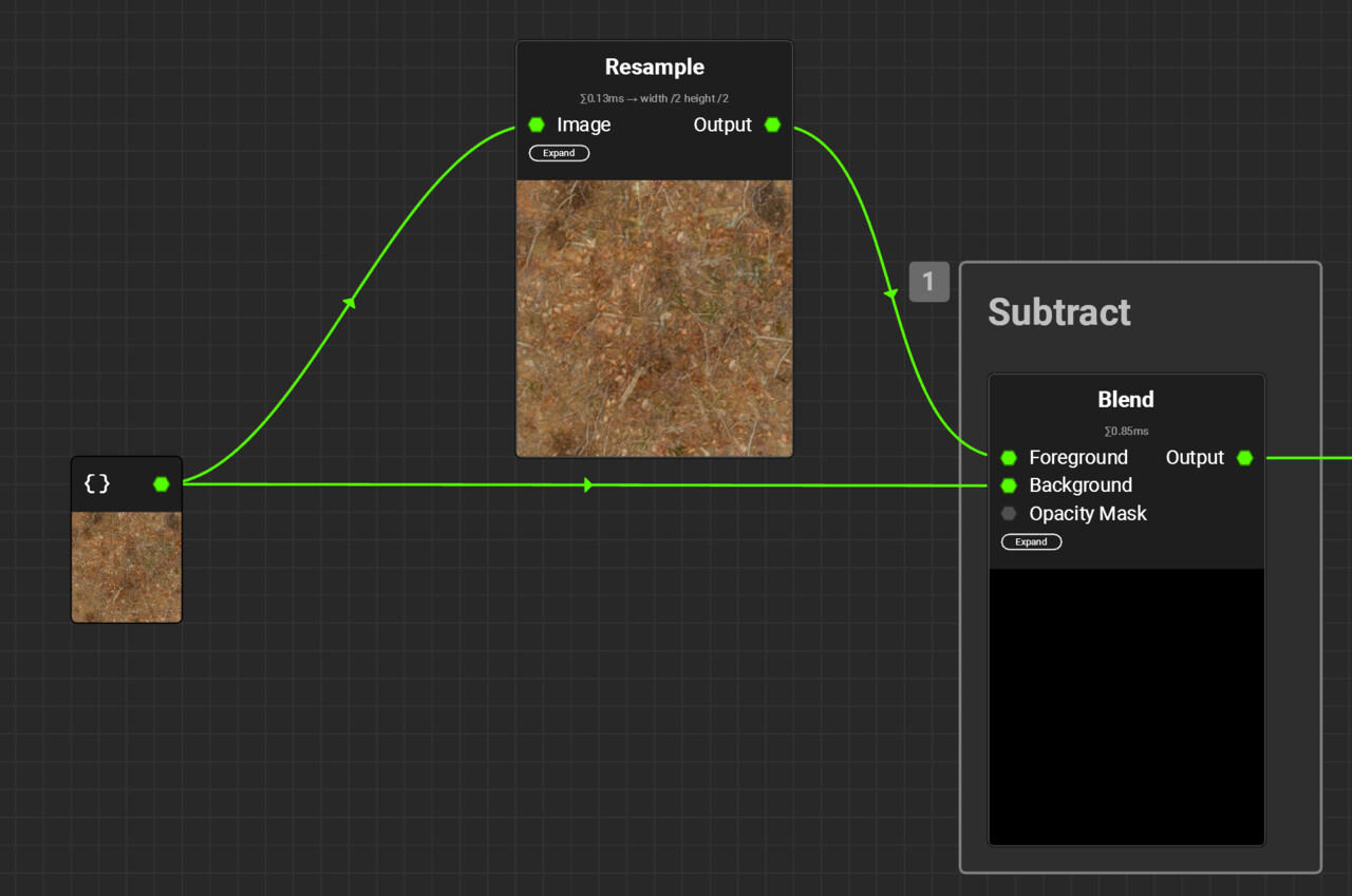
As you can see in the screenshot, the result is quite dark, as the differences between the two mips are really small. Even worse, the differences can be both positive and negative. This makes it slightly more complicated to work with them, since they aren’t visible by just looking at the node’s output. By default, InstaMAT even clamps the output values between the 0-1 range, because when it comes to images, we usually don’t want values outside of this range. Thankfully, the clamping can be disabled in the node’s settings:
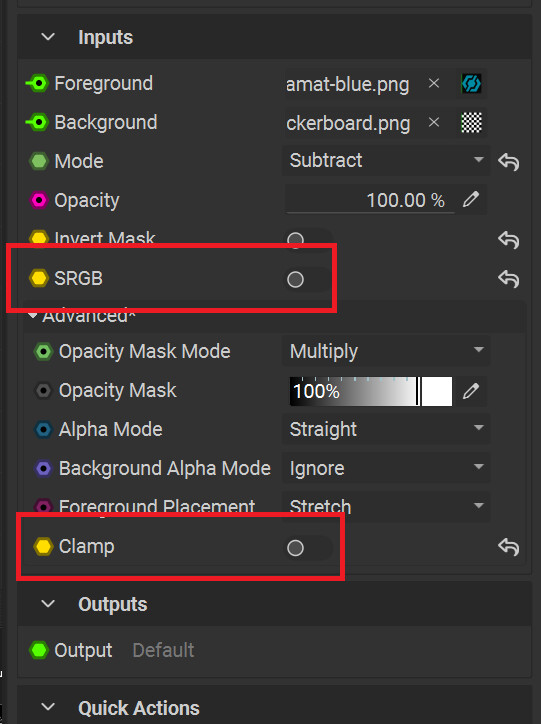
Note that I also disabled the sRGB setting. This is really important, as adding and subtracting details doesn’t work in a gamma-corrected color space. So for the rest of the tutorial, make sure to disable sRGB on all used nodes.
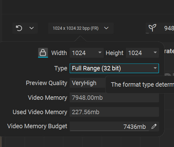
Additionally, you also need to change the format type of the project from the default, Normalized, to Full Range, otherwise the clamping being disabled on individual nodes doesn’t do anything:
Step 2 – Getting all the Levels
Once the basic setup to get the frequencies of individual mipmaps works, it’s time for some copy and paste:
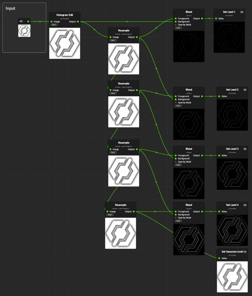
In this graph, the previously used Image node is now replaced by an Input parameter. Each frequency band is connected to a separate Output node. Note that I’ve named them Levels 1-4. Both terms, frequency bands and levels are correct, as the frequency bands are the levels of the Laplacian pyramid. Finally, the smallest mipmap, called the Gaussian Level, is output without any modifications. It contains all the lower frequencies not present in the diffs above. It’s up to you how many levels you want to use, depending on how smooth you want the transition to be. Each step makes the blend softer. As the number of needed levels depends heavily on the dominant frequencies of both the textures and the mask, I recommend exposing the number of levels as a parameter to the user.
Step 3 – Blending the Frequencies separately
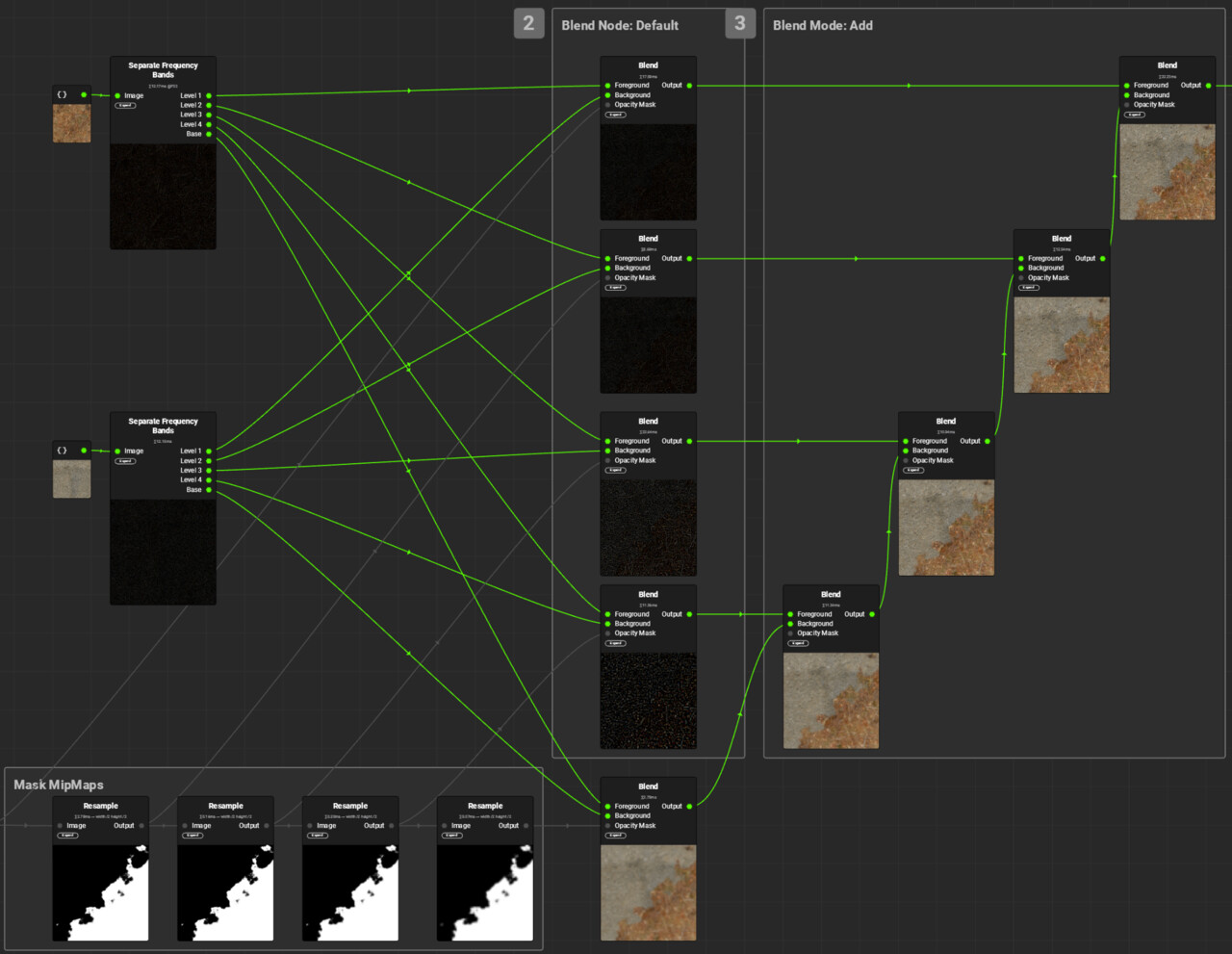
Now that you have separated the frequency bands, blend them separately. Start with the Gaussian Levels and blend them using the appropriately mip-mapped mask. The frequency bands are blended in the same way. For each blend, the appropriate mask mip map has to be used. The one with the highest frequencies uses the full resolution mask, the next uses the half resolution mask, and so on.Then all the blended frequency bands are added to the blended Gaussian Levels.And that’s it, you’re done. Just replace the images and mask with Input parameters and you can use the finished graph just like a classic blend mode:
A word of advice for when you try out this technique: Since the mask is only blurred, not sharpened, the contrast of the original mask will dictate the highest possible contrast in the blended result. I’d recommend using masks that are completely binary or close to it.
Performance
Since creating textures in InstaMAT doesn’t need to be done in real time, performance wasn’t a high priority for this implementation. I didn’t look into performance improvements like skipping layers, and outputting the individual frequency bands at full resolution is obviously an oversight that should probably be fixed. If you’re using this implementation multiple times in an already complex material, you might want to do that, but I was already quite happy with the graph as shown above.
About InstaMAT
When it comes to procedural texture creation, Substance Designer is undoubtedly the industry standard. So if you are wondering whether to use Substance Designer or InstaMAT, the deciding factors are probably not technical. InstaMAT offers pretty much all the nodes and features you’d expect, and was clearly developed in a world where Substance Designer already exists. The UI is quite similar and feels very familiar if you’re used to Substance Designer, so you won’t have much of a learning curve. I was up and running in a matter of minutes. There were a few situations where I had trouble overcoming some muscle memory I had acquired over the years (double-clicking a node in InstaMAT would open its graph, whereas in Substance Designer it would only update the preview), but in general it was a very smooth experience. That said, I can’t really say anything about more advanced features that might be critical in a professional environment, such as version control integration or tooling and automation options.The biggest advantage of Substance Designer is the myriad of existing users who share their creations, plug-ins and techniques, write or record tutorials and help each other with bugs and problems.
So would I recommend InstaMAT over Substance Designer? If you’re eligible for the free version and don’t have the biggest budget, I can easily recommend it. If you’re not and need the tool in a professional environment, Substance Designer is probably the safer option. Still, I’d recommend giving it a try. Experienced texture artists won’t have trouble getting used to it, and if you want to be less dependent on Adobe, InstaMAT is a viable alternative.